I looked at different examples of cultural body modification that are seen to increase beauty but that cause discomfort and pain but that are widely practiced.
Sunday, 13 November 2011
Level 5 Negotiated
Initially I was looking at contemporary jewellery and the concept of making pieces that could be viewed as art objects as well as pieces to adorn. I looked into jewellery on the catwalk, jewellery made from unusual materials among other things but then went on to look at fashion, trends and cultural jewellery that were uncomfortable or even painful.
Monday, 16 May 2011
Negotiated Practice
Firstly I collected imagery I found interesting.


I looked up the definition of the word movement in the dictionary to see if any of the definitions would highlight any obvious ideas on how movement can be effectively depicted. One of the definitions of movement was 'the suggestion or illusion of motion in a painting, sculpture or design' and I liked the idea of suggesting movement in an artwork.
After this I began to look at other categories of art that encompassed movement including op art and kinetic art.
I liked the idea of suggesting movement through trying to create the look of something moving downwards and getting smaller. I experimented more with card and different compositions and shapes.
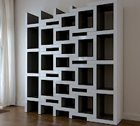
Following the show dont tell crits I thought more about size, spacing, materials, composition, colour and texture. I thought about other materials I could produce these works with I considered using wood, metal, perspex and mountboard but due to me wanting the transitions to be more subtle and for there to be more of them the materials other than mountboard were quite expensive for the amount I would need. So I decided I would use mountboard due to cost and due to it being much more resiliant than the card that I used in my previous experiments. Because of the thickness of mount board it was difficult to cut neatly and without making mistakes, so i decided i would use the laser cutter to get a cleaner more precise finish. I drew a picture of a square getting smaller turning at the same time that I felt would appear as though it was moving away or falling. Eventhough I initially used alternate colours in my experiments as I felt it highlighted the transitions more, I wanted to use only black mountboard so that the transitions would be less apparent and so that the whole piece would look more together and clean. Because of this I also decided to make the stand for piece out of the same black mountboard.


The images I collected seemed to give the idea or impression of movement and I liked the idea of trying to make a piece of artwork around movement. Following my tutorial I took a few images that made think of motion and or direction.

I looked up the definition of the word movement in the dictionary to see if any of the definitions would highlight any obvious ideas on how movement can be effectively depicted. One of the definitions of movement was 'the suggestion or illusion of motion in a painting, sculpture or design' and I liked the idea of suggesting movement in an artwork.
After this I began to look at other categories of art that encompassed movement including op art and kinetic art.
I liked the use of shape and line in theses artworks and the frozen movements illustrated in some of the pieces and decided I wanted to produce a static piece of artwork that gave the idea or suggestion of movement with the repetitive use of geometric shapes. I collected images that included repetition ,geometric shapes and direction, that I felt also suggested movement.
I experimented with stitching, wire, spirograph card and wood making shapes and patterns.
I prefered the outcome of the experiment using card as it was simple and I felt more suited to what I was trying to illustrate. Following a tutorial I looked at images of cartoon portrails of things like movement, dizzyness and falling as line is often used to show them.
I liked the impression of vertigo or of something receding and getting further away as well as smaller and looked at images of views looking down or up.
I liked the idea of suggesting movement through trying to create the look of something moving downwards and getting smaller. I experimented more with card and different compositions and shapes.
Following the show dont tell crits I thought more about size, spacing, materials, composition, colour and texture. I thought about other materials I could produce these works with I considered using wood, metal, perspex and mountboard but due to me wanting the transitions to be more subtle and for there to be more of them the materials other than mountboard were quite expensive for the amount I would need. So I decided I would use mountboard due to cost and due to it being much more resiliant than the card that I used in my previous experiments. Because of the thickness of mount board it was difficult to cut neatly and without making mistakes, so i decided i would use the laser cutter to get a cleaner more precise finish. I drew a picture of a square getting smaller turning at the same time that I felt would appear as though it was moving away or falling. Eventhough I initially used alternate colours in my experiments as I felt it highlighted the transitions more, I wanted to use only black mountboard so that the transitions would be less apparent and so that the whole piece would look more together and clean. Because of this I also decided to make the stand for piece out of the same black mountboard.
I liked the final outcome of the piece and felt that the more subtle and larger amounts of of transitions worked better visually and gave more of a suggestion of movement. I feel that the 1cm gap between the panels and minimal stand help make the piece look more polished. Although I am pleased with final piece of work I would have liked to have been able to experiment more with the size of the piece and different materials to see how that would affect the overall look and feeling. Overall I feel that piece fits my brief well although it doesn't obviously illustrate movement I think that the composition and repetition used appear as though the square is moving away and other interesting lines have also been created that I feel also illustrate direction.
Monday, 14 February 2011
Field Guide Pt 2
Initially after briefly looking at guerilla styled marketing and the adverts on phone boxes I wanted to look into recycling and try to convey a message about trying to reuse/ rethink some of the items we have an abundence of but never think about using again.
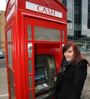
After looking at phone boxes in general and history that surrounds them I started trying to think of ways I could recycle the use of the phone box as they are virtually redundant as people have mobile phones as a means of communication. I came across many ways in which people have rethought the space and here are a few examples.
There were alot of examples of people reusing the space within phone boxes especially the older K6 red telephone boxes, as they are viewed as being pieces of iconic british street architecture and many people believe they should be retained and restored and remain on British on streets. I began to think of ways in which I could reuse phone boxes on a larger scale, something that would be viable in any town or city. Following this I looked into the rise of kiosk businesses in the States and thought maybe the phone boxes could be used for a small business or information boxes; for example an extension of the tourist information in town centres but again the majority of mobile phones have internet access so people can get that information themselves if need be. I looked at a few different types of phone boxes in different areas.
After looking at the different phone boxes I began to think about what infotrmation I wanted to convey and what would be relavent or related to a particular area whether it be history, facts or trivia. Of the areas I looked at phone boxes in I selected three and gathered information relavent or loosely related to the area; for the phone box on church lane I gathered information on Aston Villa football club as it was near by, for the city centre I Iooked into the history of the city of and facts about Birmingham and for Bournville I gathered trivia relating to alcohol due the fact that alcohol consumption is prohibeted in the area and there is currently alot of information related to the area displayed within Bournville. After thinking about the different types of phone box I decided to concentrate on using the k6 phonebox because they are viewed as being iconically British and are probably more likely to remain longer on the streets. And so I decided put up the information I had gathered in one of the K6 phone boxes in Bournville. I thought about displaying the information in poster format, or on postcards, or leaflets but I decided the best way to display the information would be on small cards that would fit into the slats on the phone boxes.
I then measured the slats and decided on a font and colour for the cards. I decided to use Times new roman as it was the most similar font to the one currently used on phone box signage and I decided to use a purple background in keeping with cadburys with white writing as I felt it stood out and was easily visable.
Overall I felt the work I produced came out reasonably well but the finish could have been better presented with better photographs and more time taken with mounting work etc.
I think in order for my work to improve I need to be more decisive and do more experimental pieces and also ask for help when needed.
Subscribe to:
Posts (Atom)


