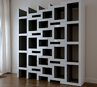


The images I collected seemed to give the idea or impression of movement and I liked the idea of trying to make a piece of artwork around movement. Following my tutorial I took a few images that made think of motion and or direction.

I looked up the definition of the word movement in the dictionary to see if any of the definitions would highlight any obvious ideas on how movement can be effectively depicted. One of the definitions of movement was 'the suggestion or illusion of motion in a painting, sculpture or design' and I liked the idea of suggesting movement in an artwork.
After this I began to look at other categories of art that encompassed movement including op art and kinetic art.
I liked the use of shape and line in theses artworks and the frozen movements illustrated in some of the pieces and decided I wanted to produce a static piece of artwork that gave the idea or suggestion of movement with the repetitive use of geometric shapes. I collected images that included repetition ,geometric shapes and direction, that I felt also suggested movement.
I experimented with stitching, wire, spirograph card and wood making shapes and patterns.
I prefered the outcome of the experiment using card as it was simple and I felt more suited to what I was trying to illustrate. Following a tutorial I looked at images of cartoon portrails of things like movement, dizzyness and falling as line is often used to show them.
I liked the impression of vertigo or of something receding and getting further away as well as smaller and looked at images of views looking down or up.
I liked the idea of suggesting movement through trying to create the look of something moving downwards and getting smaller. I experimented more with card and different compositions and shapes.
Following the show dont tell crits I thought more about size, spacing, materials, composition, colour and texture. I thought about other materials I could produce these works with I considered using wood, metal, perspex and mountboard but due to me wanting the transitions to be more subtle and for there to be more of them the materials other than mountboard were quite expensive for the amount I would need. So I decided I would use mountboard due to cost and due to it being much more resiliant than the card that I used in my previous experiments. Because of the thickness of mount board it was difficult to cut neatly and without making mistakes, so i decided i would use the laser cutter to get a cleaner more precise finish. I drew a picture of a square getting smaller turning at the same time that I felt would appear as though it was moving away or falling. Eventhough I initially used alternate colours in my experiments as I felt it highlighted the transitions more, I wanted to use only black mountboard so that the transitions would be less apparent and so that the whole piece would look more together and clean. Because of this I also decided to make the stand for piece out of the same black mountboard.
I liked the final outcome of the piece and felt that the more subtle and larger amounts of of transitions worked better visually and gave more of a suggestion of movement. I feel that the 1cm gap between the panels and minimal stand help make the piece look more polished. Although I am pleased with final piece of work I would have liked to have been able to experiment more with the size of the piece and different materials to see how that would affect the overall look and feeling. Overall I feel that piece fits my brief well although it doesn't obviously illustrate movement I think that the composition and repetition used appear as though the square is moving away and other interesting lines have also been created that I feel also illustrate direction.


No comments:
Post a Comment